Right Diagnosis: Images Slow Down Web Page Loading
At the Chrome Dev Summit 2018, Google focused on the greatest barrier to faster web sites: images. As they summarized it, “The bad news: JavaScript, images, and web fonts often bloat modern web pages. The good news: There’s probably a ton of room to improve the performance of your site.” We agree! On average, we found that most pages could reduce their image payload by 37% by using responsive images and shave seconds off their load time.
Google then proceeded to walk developers through the 4 keys to faster images:
- Appropriate file format
- Appropriate compression
- Appropriate size for display size and density
- Lazy loading
The dynamic optimization of ImageEngine can yield up to 84% payload improvement, much more than the typical 3 image approach of responsive images.
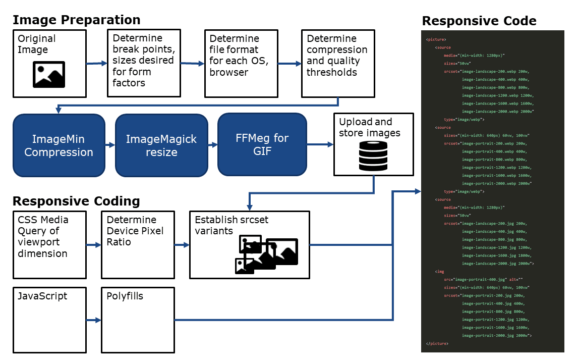
Wrong Prescription: Responsive Image Process
Drilling down on how to achieve these keys means establishing a process to learn a great deal about the image, the device, and the browser. Google talks about going through several preparatory and execution steps to generate performant Chrome images and deliver them responsively. These include:
- Know the browser
- Know the device
- Select the appropriate file format
- Select the appropriate compression
- Select the right display size
- Render the image
- Write responsive image code to select the right variant of the image

Look no further for your SMB SEO Guide - this is the only one you'll need.
Responsive Images Bloats Code, Storage Requirements, and Multiplies Coding Hours
Google pointed out that these steps should be systematized and automated. However, the process they describe (in step 2 at web.dev/fast) involves stringing together disparate tools and writing lots of additional code.
For example, without responsive images, you have 1 image and 1 simple img tag of code. Adopting the responsive image approach generates approximately 9 image variants and over 20 lines of code with complicated breakpoint calculations. Where before you could add an image in seconds, now you are looking at a much longer multi-step coding process.
And given the fast pace of change in mobile devices, image formats, and resolution, there are bound to be problems. It is a great approach in theory, but one that a human should not do. Automation is essential.
Make Chrome Images Easier: ImageEngine CDN
Instead of reinventing the wheel, there is an automated tool already available. ScientiaMobile ImageEngine takes the original image, instantly recognizes each distinct browser and device model requesting an image, instantly compresses the image into the right format, and delivers it via a global CDN. Even better, the results are greater than with traditional responsive images. Our analysis shows that the dynamic optimization of ImageEngine can yield up to 84% payload improvement, much more than the typical three-image approach of responsive images.
While there is still a solid reason you might use responsive images for art direction, ImageEngine can handle all the responsive resizing and shrink over 20 lines of picture markup down to a single line. Retrofitting your existing img tags and leveraging Client Hints will streamline your code and accelerate your web page.
ImageEngine cuts out all of the work. There’s no guesswork about breakpoints, no endless resizing processes, no debates about image quality.
In particular, let’s look at some of the keys to performant images that are features in ImageEngine:
- GIF to MP4 or WebP. Done automatically. No re-coding required.
- JPG or PNG to WebP. Done automatically.
- Compression while optimized for quality. Done automatically.
- Display size and density. Done automatically. Faster and more accurate because of ImageEngine’s server-side detection. Works with client hints.
An Image CDN that Optimizes For All Browsers, Including Apple Safari
Not surprisingly, Google focused on how to make Chrome images more efficient. But in the USA about 50% of your mobile traffic is from Apple’s Safari. Surely web developers need to optimize for them too. ImageEngine has features that optimize for Safari. It also makes life easy for developers who want to deploy quickly. Here are some of those features:
- JPG or PNG to JPEG 2000 – Done automatically. Better for Apple devices and Safari.
- Manual directives.
- CNAME for easy deployment in Magento, Shopify, WordPress, Drupal, SiteCore, Sitefinity, and Kentico.
- SSL certificates for security.
- CDN caching and delivery.
Comparing the Responsive Image Process vs. an Image CDN
In the end, the fact stands that images make up over 60% of website payload. Anything you can do to minimize that payload will improve web performance. However, developers need to think strategically about how to achieve those performance gains. They should also think longer term about maintaining the site. New devices, browsers, screen sizes, display densities, and file formats will arise. The approach that Google proposes will work for Chrome images today, but it will not deliver great performance for Safari on Apple devices. In the end, an enterprise with thousands of images is better off looking to an image CDN to handle the complexity and ensure fast delivery.