Most popular web performance testing and audit tools (e.g. Lighthouse or Webpagetest) provide a score for how quickly images load. Optimizing images provides a big improvement in the overall load time of a web page. Websites can accelerate performance between 30% and 50% by just applying common image optimization techniques.
Three techniques are typically recommended.
- Properly sizing the images to the correct pixel dimensions. Websites frequently serve images in dimensions that are much larger than required for the size and resolution of the requesting device.
- Efficiently encoding and compressing images to a reasonable quality. Image files typically are rendered in high-quality that generates a much larger file size, but provides no perceptible visual difference on most devices.
- Using next-gen image formats. Images should be converted and served in more efficient image file formats like WebP or JPEG 2000.

For the above example website tested with Google’s Lighthouse, addressing these three image issues correctly would make the page 3.09 seconds faster! When considered in terms of bounce rate impact, accelerating a website’s load time from 9.09 seconds to 6 seconds would reduce bounce rate from 61% to 46% according to a study by Pingdom. A faster mobile website also means better SEO. The return on investment for reducing the load time and bounce rate is significant.
Implementing Image Optimization with Responsive Images Techniques
Current benchmarks indicate that about 50% of website traffic to the typical website originates from mobile devices. For many sites, the mobile device share is significantly higher, which adds complexity to the problem. Over the last couple of years, there have been many initiatives aiming to solve image delivery on this fragmented base of web-enabled devices.
The responsive image syntax is the most frequently discussed effort to address the challenge of serving the right image to the right device. However, when the smoke cleared after its roll-out, responsive images solved only part of the image delivery problem while adding a great deal of complexity and work to the development process. The vast diversity of devices and browsers requires a developer to generate many derivatives of the original image. Responsive image syntax also requires writing complex logic to select and serve the right image to the right device.
Options for Implementing Image Optimization
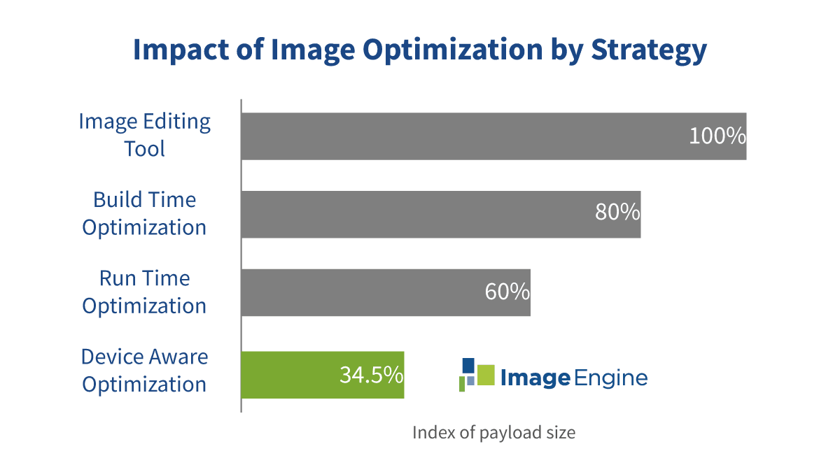
What additional options exist for implementing image optimization? To alleviate the workload of image optimization, there are multiple strategies that combine different levels of automated image optimization and device detection. We will consider four strategies for optimizing images: Image Edit Tool, Build-Time Optimization, Run-Time Optimization, and Device-Aware Optimization.
- Image Editing Tool: This is an image straight out of a graphics editor like PhotoShop. Basically, what you might receive from your design department after a request to "make the file smaller."
- Build-Time Optimization: When a website is built or an image is published, some generic optimization can be done by a task manager to generate multiple static image variants. There is no device detection, format conversion, or CDN-assisted image delivery.
- Run-Time Optimization: When a device request comes to a website, the server performs a basic analysis of the request header to enable run-time format conversion, support for client hints, or static resizing. No true device detection occurs, just simple OS and browser identification. This service can be offered by a CDN or can be coupled with a third-party CDN.
- Device-Aware Optimization: The edge-server of the content delivery network identifies the specific device model and all relevant capabilities of its screen, browser, OS, and other properties. The platform either generates a new image tailored to the exact specification of that device or delivers a pre-existing version from its cache. ImageEngine is the only solution that leverages WURFL device detection to drive image optimization.

Struggling to get your SEO just right? Start with your image optimization, and start with our blog!
All of these options can be combined with responsive image techniques, but their impact on web performance varies dramatically. These techniques also vary in how they simplify a developer’s image workflow processes. The goal is to reduce image management workflow cost while achieving the greatest image optimization levels.
The Best Option for Image Optimization
ImageEngine addresses the problem by using device detection to feed the image optimization algorithms with extremely accurate data. Thanks to the built-in WURFL device detection, ImageEngine can produce the optimal derivative image for any device and browser on the market.
We often get the question of how ImageEngine compares to other “image optimizers” on the market. Instead of listing all services here, it makes more sense to compare the different image optimization strategies with the Device-Aware Optimization strategy ImageEngine uses.
To document the value of real device detection in image optimization, we set up a test case to compare how much the image payload can be reduced by the strategies above. In the real world, the device and browser mix that are requesting the images will influence the results. In our test case, we selected a typical mix from an eCommerce site in Asia where mobile and social media account for 60–70% of traffic.
We ran the same traffic mix to copies of the same page with the same images, only with different image optimization strategies. Then we summarized and indexed the image payload for each. Assuming that 100% is the baseline of unoptimized images coming from the first image editing tool strategy, the best score of 34.8% comes from Device-Aware Optimization. ImageEngine using Device-Aware Optimization reduced the image payload to 34.8% of the original. In other words, a 65.2% savings! We regularly see results like this in our demo tool.

But how can we isolate the added value by device detection alone? The most interesting part of this analysis is the difference between the Device-Aware and the Run-Time Optimization strategies. Many of the solutions found in the Run-Time Optimization category claim to use device detection, but in reality, they are just using regular expressions on the user-agent string or accept header. Run-Time Optimization may use these expressions to test for WebP support or a Safari browser version to determine JPEG2000 support. They may also leverage client hints to determine screen size and pixel density. However, if client hints is not enabled, then Run-Time Optimization solutions cannot deliver optimization to those specifications.
In order to make the comparison as fair as possible, we set up the test to use the same ImageEngine image optimizer for both the Run-Time Optimization and Device-Aware Optimization scenarios. The only difference was the inputs to the image optimizer. Under Run-Time Optimization, we consulted the Accept header and did some basic regular expression checks on the user-agent string. However, under Device-Aware Optimization, we used many inputs from WURFL device detection. If client hints is available, then Device-Aware Optimization would also leverage those too. This methodology isolates the added value of true device detection.
Comparing results from Run-Time Optimization’s regular expressions versus Device-Aware Optimization, we see that true Device-Aware Optimization from ImageEngine generates a whopping 42% less image payload (dropping from 60% to 34.8%).
Conclusion
A Run-Time Optimization service like some listed here will definitely reduce the image payload but only down to around 60% of the original. With accurate device information from WURFL, ImageEngine will reduce payload down to only 34.8% of the original, which is 42% less data transferred than tools without proper device detection like Cloudinary and imgix. All of this optimization without compromising the visual image quality -- sounds like a perfect solution!
