Are 3 Image Sizes Enough for Responsive Web Design Sites?
The answer is: No!
If you care about mobile performance and payload, then you need a better solution than only 3 image sizes. We evaluated over 53 million requests for images from 1.6 million distinct urls (see our MOVR report). Most websites receive more than 50% of their traffic from mobile devices. Given that their are more than 80,000 different types of mobile devices using the web, it does not take long before you need more image variants to match the screen, DPR, and file format requirements from visitors. On average, it takes only 8 random requests to surpass the need for 3 image sizes.
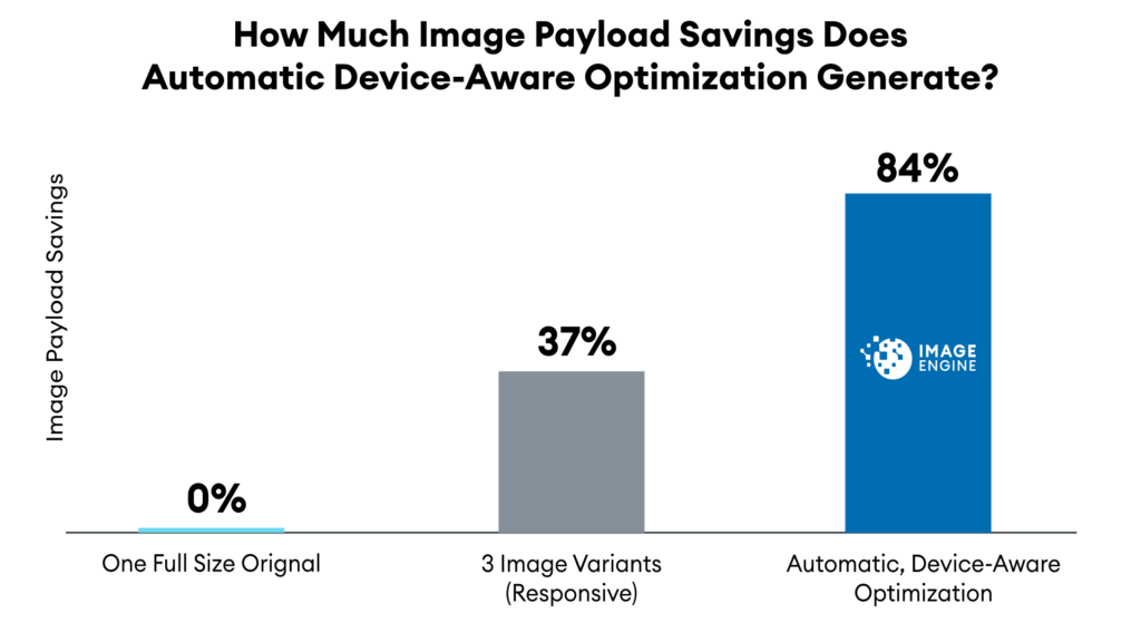
Resizing to the standard 3 versions helps improve payload savings to 37% vs. the original. But if you automatically detect the actual device, resize, and compress to an optimal size, then you can save 84% of the payload. For image-heavy sites with a large amount of mobile users, this performance improvement could have a big impact on user experience and e-commerce conversions, potentially generating millions of dollars.
The Impact of Lazy-Loading Images in RWD
Users of Responsive Web Design (RWD) agree that performance is improved if you have images resized to the size of the form factor of the device. Typically, people create 3 versions: desktop, tablet, and smartphone. In RWD, “lazy-loading” of images is used to select which version to send to the device. Lazy-loading loads the HTML and then uses JavaScript to figure out which images to download. Usually, it queries the viewport width, compares that width against static breakpoints, and then it selects one of three sizes.
There are two major problems with lazy-loading. It significantly slows down the browser pre-loader by putting JavaScript in the critical rendering path. If you opt or lazy loading, you should avoif third party JavaScript libraries. Instead use browsers’ native lazy loading.
There is also a significant risk of downloading an over-sized version of the image. With a limited number of breakpoints, the variance in size – even within the smartphone category – means that a significant percent of images downloaded are over-sized.
Replacing lazy-loading with the new Responsive Images specification will address the pre-loading issue, but the risk of downloading an over-sized version of the image is just as significant.
How Many Breakpoints Do You Need?
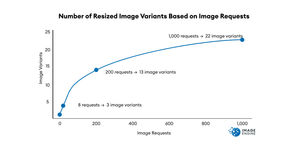
How serious is the image breakpoint problem? Or asked differently, how many different versions do you need to achieve more savings? Over time, the number of image requests increases the variety of devices visiting your sites. Based on our research data on serving images to thousands of sites, it takes:
- At 8 requests, you need 3 image-size versions.
- At 180 requests, you need 11 image-size variants.
- At 1,000 image requests, you surpass 20 image-size versions.
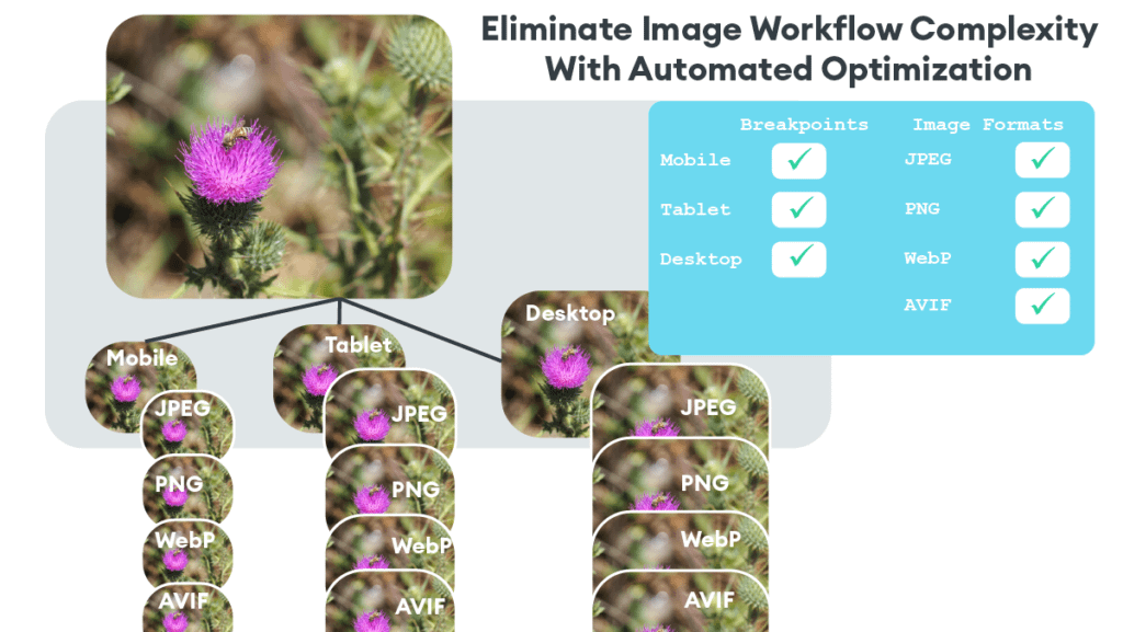
This does not even take into account additional variants for JPEG vs. WebP vs. JPEG 2000 vs. AVIF. Factors like next-gen image file format and pixel density can send the required number of variants sky-rocketing.
Avoid the Headache and Complexity of Responsive Images
Instead of trying to tackle the task of continuously resizing and adjusting breakpoints to support responsive images, an automated solution is easier.
ImageEngine is an easy to use image CDN. By using a plug-in or updating your existing img tags, you can have perfectly optimized images on your entire site in under 15 minutes.
Methodology
Data: We collected image request data from 1.6 million distinct urls using the ImageEngine service over a 4 month time period. We collected 53.5 million image requests coming from a variety of devices.
Image size versions: Our WURFL device detection can identify the device requesting the image. WURFL provides a number of WURFL device capabilities – including dimension and resolution, OS, and browser. Based on WURFL capabilities, we can determine whether a new image version is required for a device, or whether an existing image version suffices.
The actual number of requests for an image various based on traffic visiting the site. The curve shown above represents an equation that statistically best fits the image request and image-size version data we have collected.
Payload savings: The ImageEngine service records the size of the original image. Therefore, we can extrapolate the Original payload size by multiplying the original file size times the number of requests.
For the 3 Versions, we simulated the impact of using 3 versions: desktop, tablet, and smartphone. Desktop had a width of 1024 pixels. Tablet corresponded to the iPad with a width of 768 pixels. Smartphone had a width of 375 pixels based on the the Apple iPhone 6S.
For the Multiple Versions, we have actual results of the payload delivered from the ImageEngine service when images are resized and compressed for the capabilities of a specific device.