What is the Problem with Images?
Anyone who has ever waited a long time for a web page to load knows that it is extremely frustrating. Website loading speed is directly linked to the bounce rate of a site: the longer visitors wait, the more likely they will abandon the site. For many eCommerce or service-oriented websites, this means lost sales or conversions. For many large eCommerce websites, this amounts to a multi-million dollar problem that needs to be solved.
Images are a major cause of slow websites. On average, over 60% of a website’s data payload is images. And both websites and images continue to bloat over time. From 2014 to 2021, the median mobile website has grown from 561kB to 1,950kB, or almost 250%.
Google recognizes that this page bloat degrades performance and has a negative impact on the user experience. To encourage websites to solve this problem, they have started to measure performance with a tool called PageSpeed Insights. This PageSpeed score impacts how Google ranks search engine results. With PageSpeed scores, websites have the incentive to improve performance and therefore Google rankings.
This whitepaper reviews the pitfalls of traditional ways to address image optimization using responsive images. It also provides a more effective and easier solution provided by the ImageEngine image optimizing CDN.
What are Responsive Images?
Responsive images, as defined in the W3C Working Group, use markup that enables the browser to request different image URLs in response to different environmental conditions. For example, a desktop screen presents very different environmental conditions than a smartphone or tablet. A browser should be able to respond to these conditions and dynamically display an optimal image.
These environmental conditions are typically expressed to the browser through CSS media features. Some common media features are device pixel ratio (DPR) and maximum width of the screen.
To achieve their goals, the working group introduced several new HTML markup elements and attributes to assist with responsive images. These include adding the sizes and attributes to the <img> element. The working group also added a brand new <picture> element. We will explore how these can be used in the examples below.
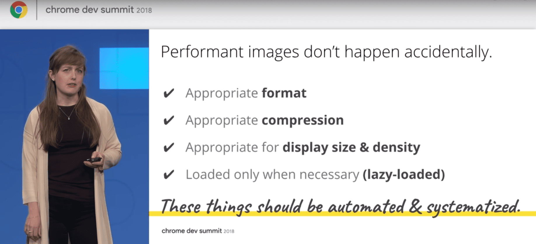
Since responsive images were introduced several years ago, many organizations have evangelized its benefits. For example, at the Chrome Dev Summit 2018, Google focused on images as the greatest barrier to faster websites. They also put together a guide to help developers grapple with responsive images. Furthermore, Google listed some tools on how to optimize images, including ImageEngine by ScientiaMobile.
Nevertheless, adoption of responsive images has remained challenging for many developers. Why?
Responsive images (without the right tools) increase complexity and add more work. Implementing responsive images raises the classical trade-off between cost, time, and quality: “How cheaply and quickly can I make this web page with a reasonable level of responsive qualities?”
In this paper, we will analyze what makes responsive images so difficult to deploy. We will also provide some guidance about ways to use tools that simplify and automate responsive images.
What is Involved in Deploying Responsive Images?
Google points to four key optimization steps that will lead to faster responsive images:
- Reformatting to the appropriate display size and pixel density of the screen
- Converting to the appropriate file format
- Applying the appropriate image compression
- Using lazy loading
Below is a basic example that focuses on the first step, reformatting to the resolution of the device. The snippet below tells the browser to download and display pic_480.jpg for 1.5 dpr screens, pic_640.jpg for 2 DPR screens and use the pic_320.jpg as a fallback for all other screens.
Here is another example that focuses serving images that are not only different pixel sizes, but also images that should be cropped differently or have a different aspect ratio:
<img
src=”pic_320.jpg”
srcset=”pic_480.jpg 1.5x, pic_640.jpg 2x,
width=”320” alt=“fixed width”>
As displayed above, three versions of the image are required. Someone, or something, must create them, which costs money and takes time.
The three DPR cases illustrated above are a conservative estimate. According to our analysis, in order to address 95% of devices with images specifically tailored to their device pixel ratio, developers need to provide nine different images. And who says there won’t be 15 different device pixel ratios to consider in the future?
One can make the responsive code more specific by using the sizes attribute to direct the browser to use the right image for certain viewport sizes by applying media queries. This is powerful functionality, which also handles device pixel ratio. However, what started out as a simple scenario for applying srcset can quickly balloon one’s code and require much more work in preparing multiple sizes of images.
Here is another example that focuses serving images that are not only different pixel sizes, but also images that should be cropped differently or have a different aspect ratio:
<picture>
<source media=”(min-width: 36em)”
srcset=”2art_full_3050.jpg 3050w,
2art_full_2048.jpg 2048w,
2art_full_1280.jpg 1280w,
2art_full_1024.jpg 1024w,
2art_full_800.jpg 800w,
2art_full_400.jpg 400w”
sizes=”50vw” />
<source
srcset=”2art_crop_1860.jpg 1860w,
2art_crop_1280.jpg 1280w,
2art_crop_1024.jpg 1024w,
2art_crop_800.jpg 800w,
2art_crop_400.jpg 400w”
sizes=”100vw” />
<img src=”2art_crop_320.jpg” alt=”art”/>
</picture>
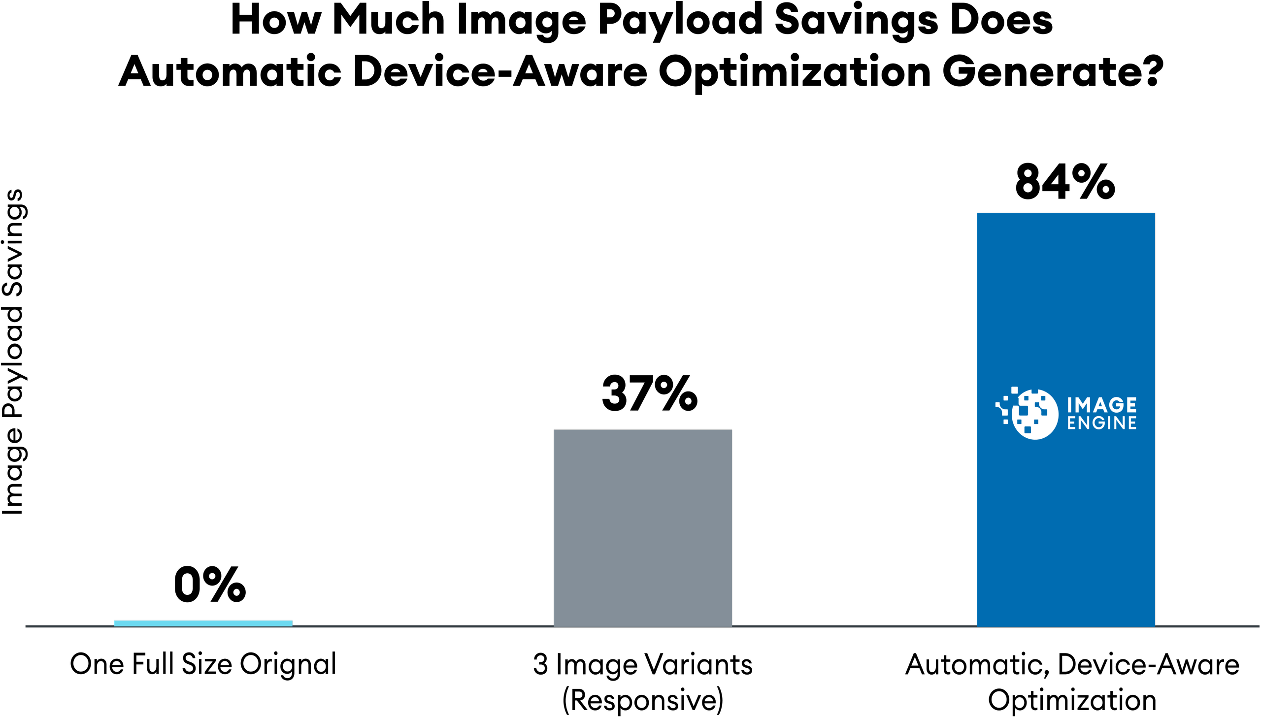
The inner workings of the picture element is well described elsewhere and with a little exploration, one can further expand and tune the above code. The example above is quite comprehensive and covers high dpi tablets (like Kindle Fire HDX 8.9”) all the way down to a 320px image. It is up to the browser to pick whatever srcset it deems appropriate. Of course, the more options provided, the better the result will be in terms of saved bandwidth and image quality. In the example above, there are now 12 versions of the same image. Twelve! The performance savings difference between supplying 3 image choices versus more than 12 images is substantial — almost an 84% improvement in payload size.
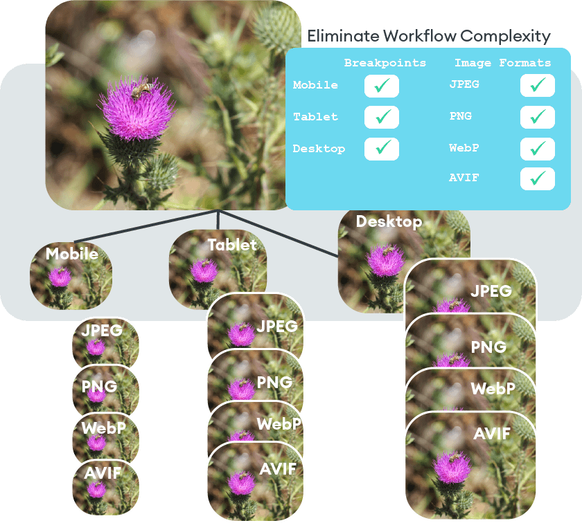
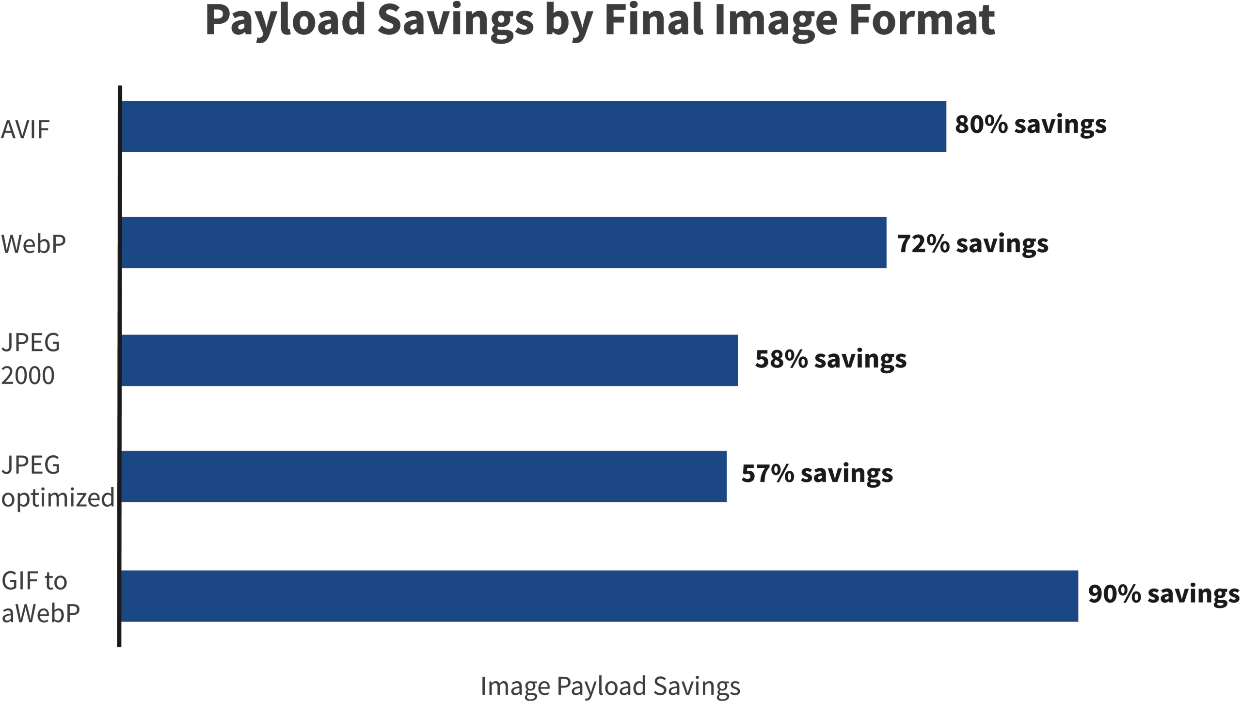
This is achieved without offering different image formats. There are several new modern image formats like WebP, AVIF, and JPEG 2000 that dramatically reduce image payload without sacrificing quality. Adding the logic to serve these image format options will multiply the code length even further. With the power of media queries, developers can make this code as complex or simple as deemed necessary.
And the impact of this alteration is not only on codebase size. It also impacts the workflow for image creation and management. All of these versions will require the developer to generate, manage, and store these image options.
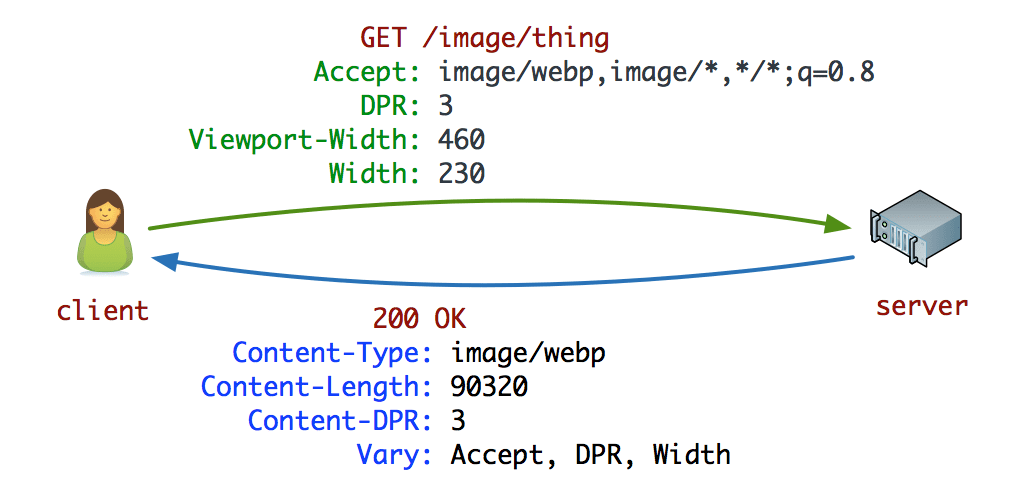
What Are Client Hints and How Do They Help?
Client Hints are the missing link between the browser and the server when it comes to layout information. Instead of specifying every possible image breakpoint, pixel density, and format in a responsive image markup, Client Hints appends the current scenario to the HTTP request, allowing the web server to pick the perfect fit — also known as content negotiation. This means the browser can inform the server information of the device’s pixel density, preferred image format, and viewport size. If the server is equipped properly, then it can generate and respond instantly with an image that is optimized to that device’s environmental condition. A properly-equipped server has an image management service that takes the Client Hints and either dynamically generates or selects and serves an image tailored to the parameters. Either way, the developer needs a service that generates multiple versions of the images.
Potentially, Client Hints streamlines the image selection process and improves performance overall. However, most developers do not choose to use Client Hints for several reasons. First, many developers do not want to build a server-side image management service that leverages Client Hints, even if it provides performance improvements. Serving the correctly-sized image, to the proper device, in the proper resolution, as fast as possible is not as easy as one might think. It is best left to an external enterprise-grade service. Second, Client Hints is currently supported only on Chrome, Edge, and Opera, so developers will need to plan accordingly for Safari, and other browsers that do not support Client Hints. Edge server device detection is a good solution that covers all browsers when Client Hints is not available.
So where does this leave developers? Without Client Hints, developers must rely on the verbose responsive HTML markup that was initially mentioned. The browser needs to perform a round trip to determine the image breakpoints and select the appropriate version. With Client Hints, developers need an automated service that can leverage this information.

Look no further for your SMB SEO Guide - this is the only one you'll need.
How to Simplify the Responsive Image Process
Simplifying responsive images requires establishing a process to learn a great deal about the image, the device, and the browser. Google recommends several preparatory and execution steps to generate performant images (for Chrome) and deliver them responsively. These include:
- Know the browser
- Know the device
- Select the appropriate file format
- Select the appropriate compression
- Select the right display size
- Render the image
- Write responsive image code to select the correct variant of the image
Simple, right? The steps are clear enough, but Google makes it sound easy and painless. The reality is that a simple website with a small number of images might be able to follow this responsive image process. But implementing this workflow on a site with thousands of images while maintaining quality is challenging and potentially very labor-intensive.
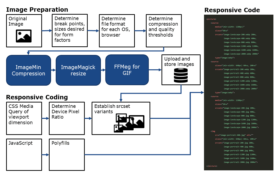
These steps should be systematized and automated. However, the process Google describes (in step 2 at web.dev/fast) requires stringing together disparate tools and writing a great deal of additional code.
For example, without responsive images, there is one image and one simple img tag of code. Adopting the responsive image approach generates approximately nine image variants and over 20 lines of code with complicated breakpoint calculations. Before, developers could add an image in seconds. Now, they are looking at a much longer multi-step coding process.
And given the fast-pace of change in mobile devices, image formats, and resolution, there are bound to be problems.
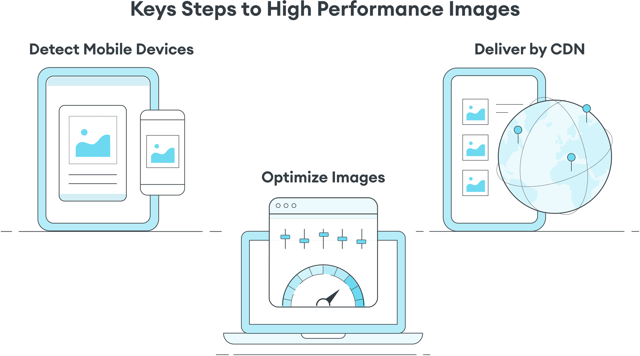
A Better Solution: Automation Through an Image CDN
Instead of reinventing the wheel, there is already an automated tool available. An image CDN with device-aware edge servers can automatically manage responsive images’ complexity. ImageEngine takes the original image, instantly recognizes each distinct browser and device model requesting an image, compresses the image into the right format, and delivers it via a global CDN. On top of this automated processing, ImageEngine provides better results than with traditional responsive images. Our analysis shows that the dynamic optimization of ImageEngine can yield up to an 84% payload improvement, which is much more than the typical three image approach of responsive images.
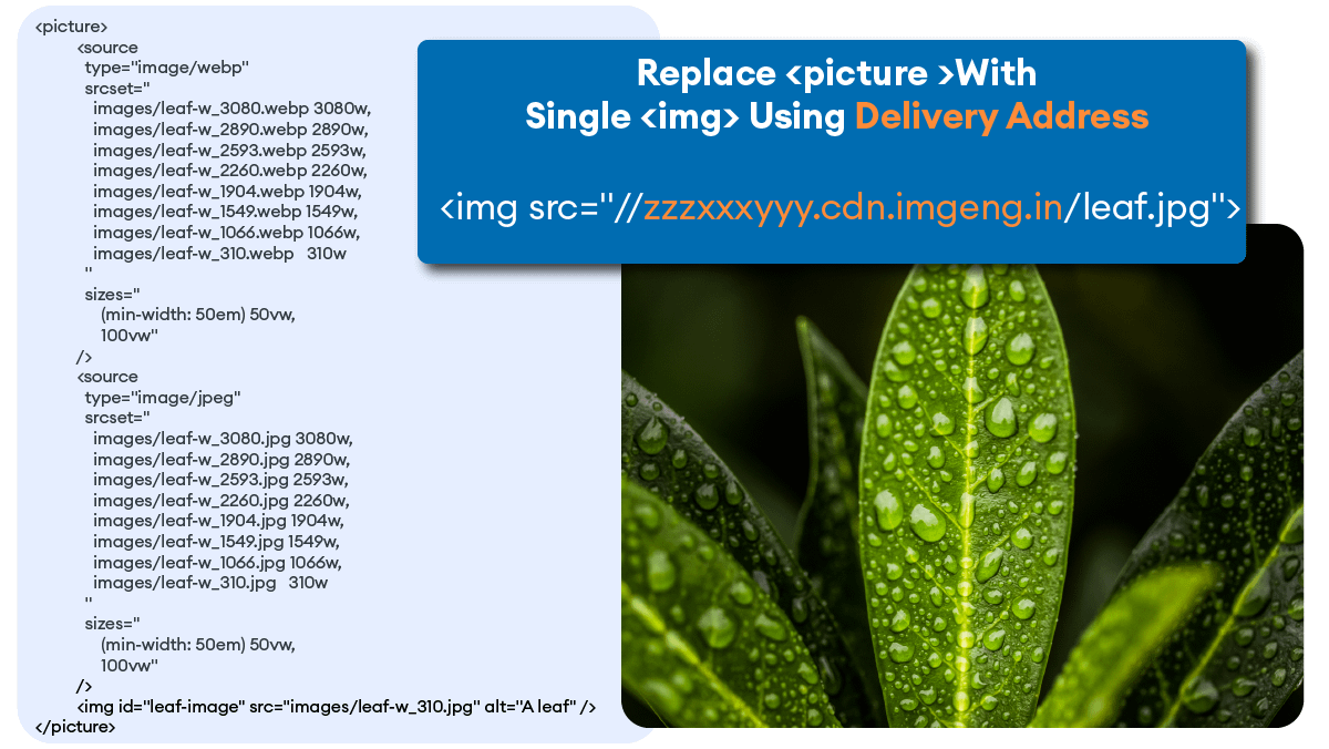
While there are still solid reasons that a developer might use responsive images, say for art direction, ImageEngine can assist by handling all the responsive resizing and shrinking over 20 lines of picture markup down to a single line. By retrofitting existing img tags and leveraging Client Hints, developers can streamline code and accelerate their web pages.
ImageEngine cuts out all of the work. No guesswork about breakpoints, no endless resizing processes, and no debates about image quality. We make it simple.
In particular, here are some keys to performant images that are already features of ImageEngine:
- Display size and density. Done automatically, faster, and more accurately because of ImageEngine’s server-side device detection.
- Works with Client Hints.
- JPG/PNG to WebP. Done automatically.
- JPG/PNG to JPEG 2000 – Done automatically. Better for older Apple devices and Safari.
- GIF to MP4/WebP. Done automatically. No re-coding required.
- Compression while optimized for perceptible quality. Done automatically.
- Easy integration with Magento plugin, WordPress plugin, Shopify, Drupal, SiteCore, Sitefinity, Prestashop, SAP Commerce Cloud, and Kentico.
- Great development tools for React, Gatsby, Vue, and Angular.
- Access to AWS S3 or Google Cloud Storage.
- URL directives commands to control individual images and art direction.
- Custom Delivery Address to match your existing domain.
- SSL certificates for security and WAF with DDoS.
- CDN caching and delivery with cache purge API.
- Performance and usage statistics.
- Dedicated managed edge servers and/or optimization engines for enterprises with high usage and private Cloud needs.
- 24/7 email support and ticketed enterprise support.
What is an Edge Server on a Content Delivery Network?
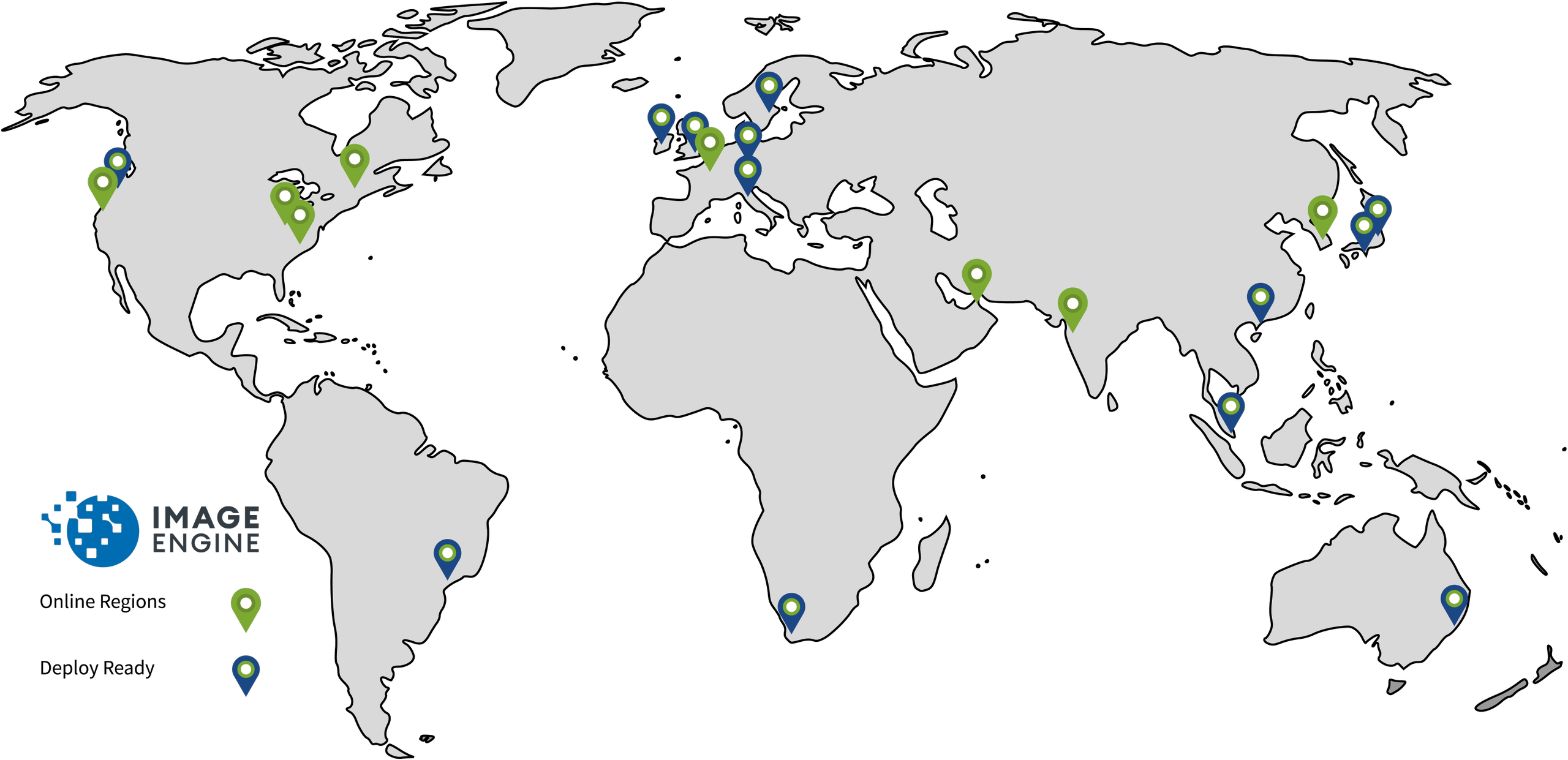
In addition to automation, ImageEngine offers other performance benefits because of its edge server architecture. An edge server is a server located at various Points of Presence (POP) around the globe. Content Delivery Networks (CDN) use these edge servers to store content in cache in close geographic proximity to the requesting users and their devices. Because they are closer and have content readily available in caches, edge servers can deliver content faster than a single origin server that might be far away. For example, ImageEngine has device-aware edge servers available at more than 20 POPs around the globe.
What Makes a Device-Aware Edge Server?
Typically, edge servers hold content and they deliver what is requested. In contrast, a device-aware edge server has device detection built into its business logic. And this device information drives a number of optimizations in the image CDN. For example, when a user in Singapore uses his/her Samsung Galaxy S8 to browse an eCommerce site, its initial HTTP request hits the edge server in Singapore. The server instantly identifies the Samsung Galaxy S8 and several important capabilities of the device: OS version, screen pixel density, screen resolution, support for advanced image and video formats (e.g. JPEG 2000 or WebP). As part of a CDN, this edge server can act on the image request instantly, or it can share device information with other parts of the image CDN.
Struggling to get your SEO just right? Start with your image optimization, and start with our blog!
Do Device-Aware Edge Servers Make Delivery Faster?
If the edge server has identified a specific device model before, then it will have images for the requested web page that are tailored exactly to the specs of that device. 98% of the time, the edge server can make a lightning-fast response from its cached images. Not only are the cached images geographically close to the end user, but the images also have dramatically smaller payloads than the original-sized images. How much smaller? Up to 80%!

With device-aware edge servers delivering dramatically smaller images from geographically close locations, websites are able to cut several seconds off their page loading time.
How Does Device Information Reduce Image Payload?
Typically, an image CDN like ImageEngine will have several variations of a website’s images in its primed cache at the edge server. However, for a small percentage of requests, the edge server encounters a device model it has not seen in the recent past. The edge server can then send the image request and the specifications of the device to the image optimizer server. The image optimizer pulls the website’s high-quality original image. It then performs three steps to reduce image payload.
First, ImageEngine uses the device resolution to change the size of the image. For example, it cuts an original image 3,000 pixels wide to only 1,440 in the case of the Samsung Galaxy S8.
Second, it compresses the image using an image optimizing tool. This cuts out extraneous data that does not impact the visual quality of the image on the requesting device. ImageEngine knows just how far to compress based on the device intelligence from edge servers.
Third, ImageEngine selects the most efficient file format supported by the device, browser, and its operating system version. For example, for the Samsung Galaxy S8 running Android 8.0 and a Chrome browser, it would convert from JPEG to WebP. WebP is an image format from Google that stores image data more efficiently than JPEG. On average, converting images to WebP (and applying other optimizations) saves 79% of image payload.
In the rare instances when ImageEngine needs to create a new optimized image, it will process and respond in milliseconds. This real-time optimization approach helps tailor image payload reduction and only convert and keep in cache images that are commonly requested. And with a cache hit rate of 98%, the response time is faster than a basic CDN or other image management solutions.
Comparing the Responsive Image Process to an Image CDN
In the end, the fact stands that images make up over 60% of website payload. Anything developers can do to minimize that payload will improve web performance. However, developers need to think strategically about how to achieve those performance gains.
The responsive image specification has ambitious and worthy performance goals. With <picture>, srcset, and sizes, developers have the syntax to deliver responsive images. However, this power comes with a huge increase in workflow complexity.
Developers should think longer term about maintaining the site. New devices, browsers, screen sizes, display densities, and file formats will arise. An unautomated responsive image approach is difficult to implement and tedious to maintain. In the end, an enterprise with thousands of images is better served using an image CDN to handle this complexity and ensure fast image delivery.
To simplify responsive images and achieve performance goals, it is best to consider an image CDN like ImageEngine. Most image CDN users see up to 80% reduction in image payload and dramatically faster website load time. What this means for eCommerce sites is faster site speeds, especially on mobile. Faster eCommerce sites can translate this increased speed into millions of dollars of additional sales as fewer users abandon their shopping carts and checkout successfully and without interruptions in their user experience.